Book Finder - UX Design
Software
Figma, Procreate
Team
Solo
Timeline
3 Months
Prototype
Background
Many book lovers have a difficult time finding new books that fit their preferences. Therefore, I did user research in order to create a suitable app, so users can find books based on their specific wants.
Challenge - People struggle to find new books to read based on their preferences.
Goal - Do research and create an app for book lovers to find new books to read.
Interviews
I prepared questions and conducted 5 interviews to better understand people’s experience with reading books. Most interviewees use Goodreads and TikTok to find books. They use Goodreads' feature of searching by topic, and like TikTok because it gives personalized recommendations.
These insights made me decide to create a explore by category button and short videos tab for users to find books. This way users can get personalized boom rcommendations based on either filters, or from their favorite book-content creators.

Sketches
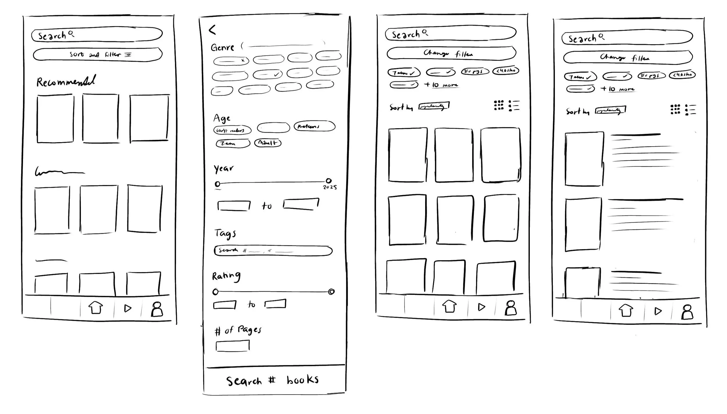
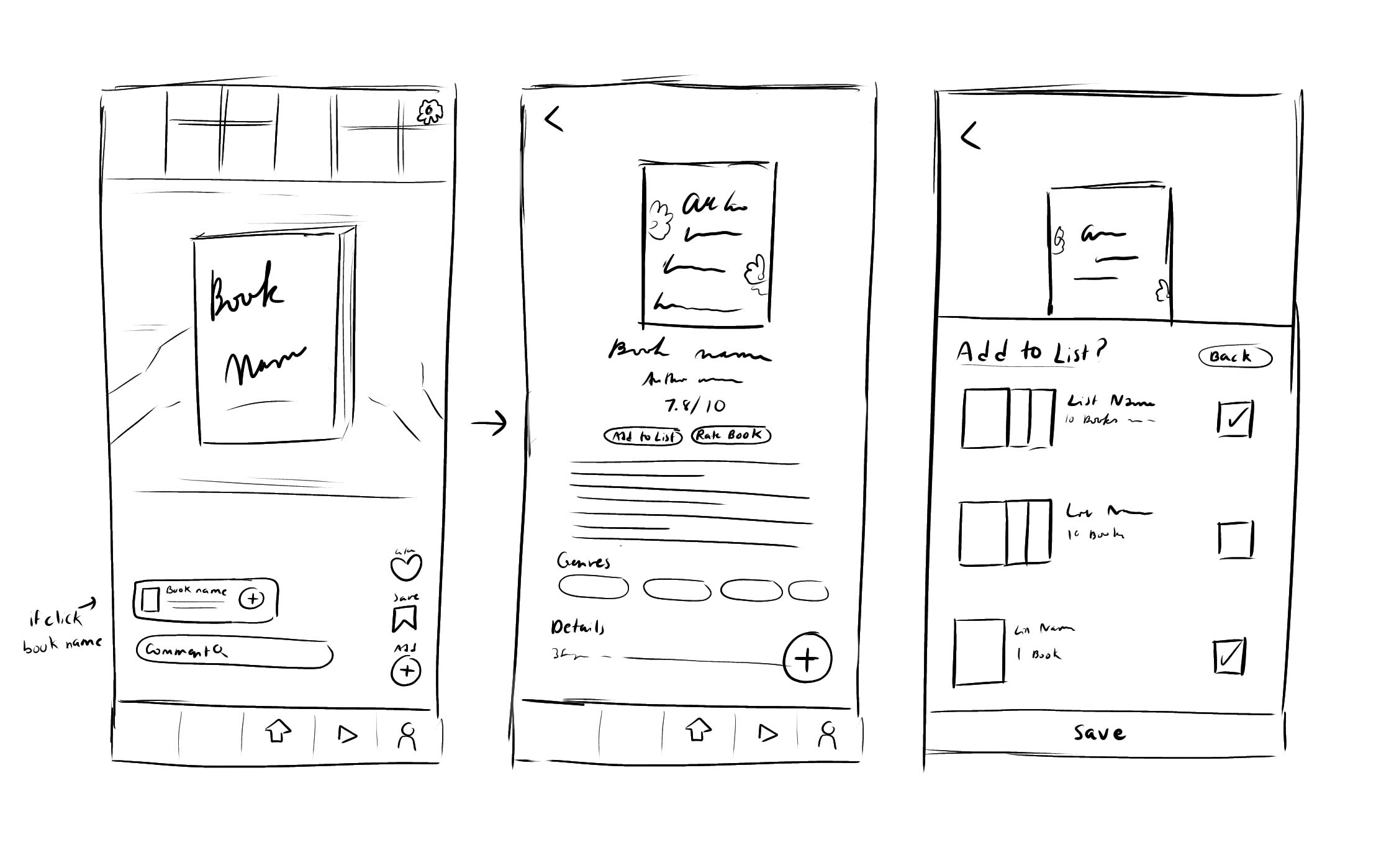
Next, I sketched wireframes in Procreate.
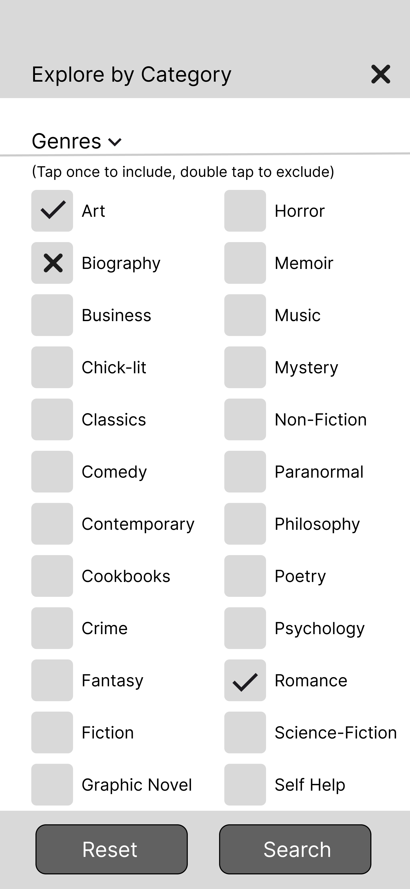
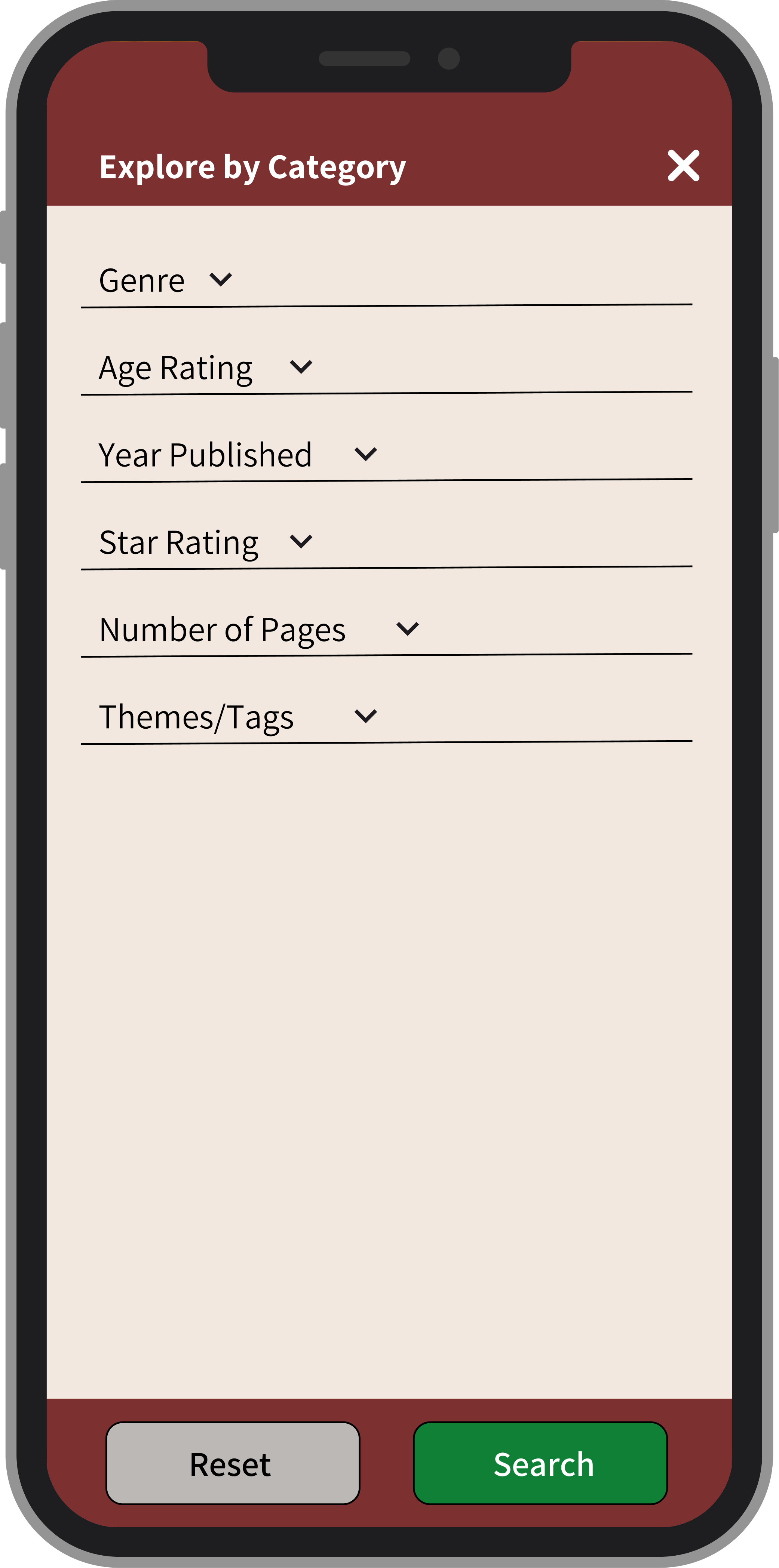
The left flow illustrates how users can sort and filter books by specific categories like genre, age rating, year published, rating, etc.
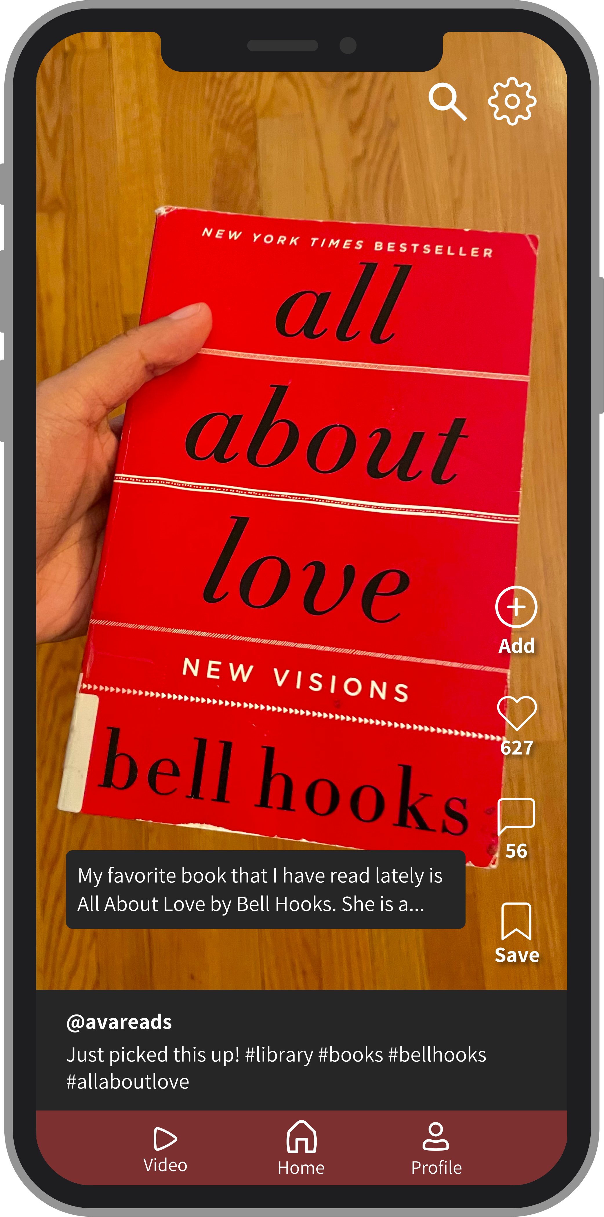
The right flow shows how users can find new books through watching short videos from book-content creators. They can add books from the video to their lists.
Low-Fidelity Wireframes
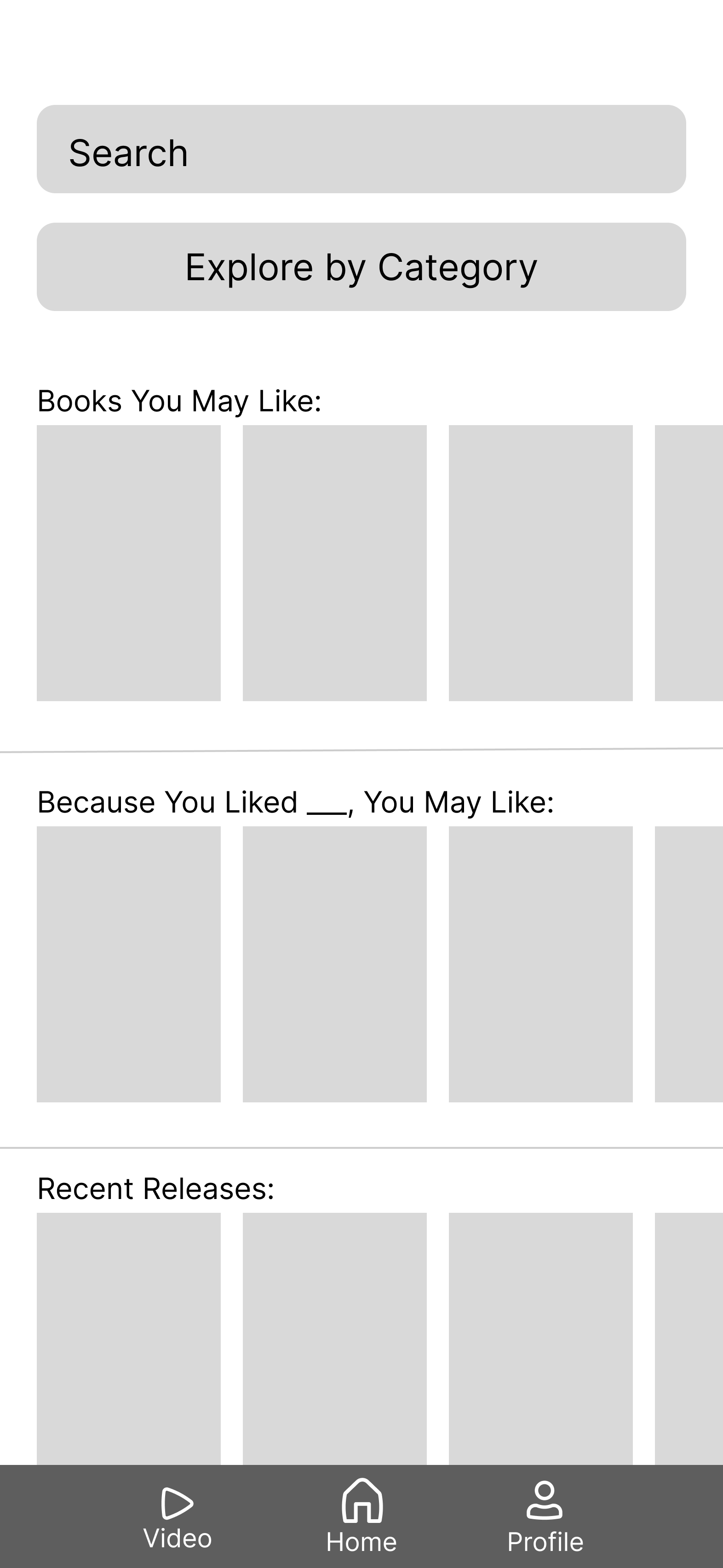
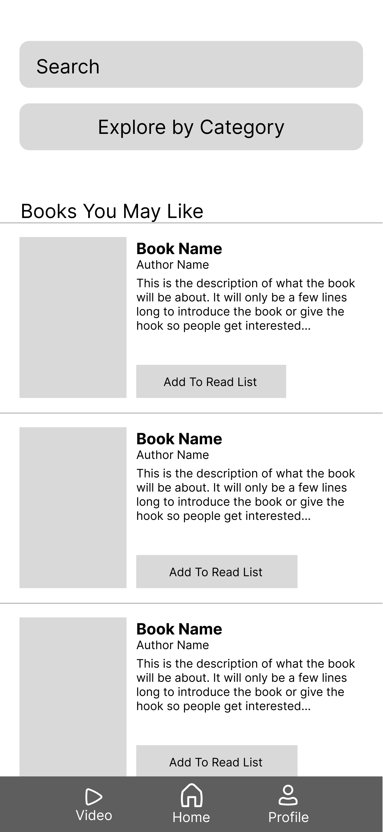
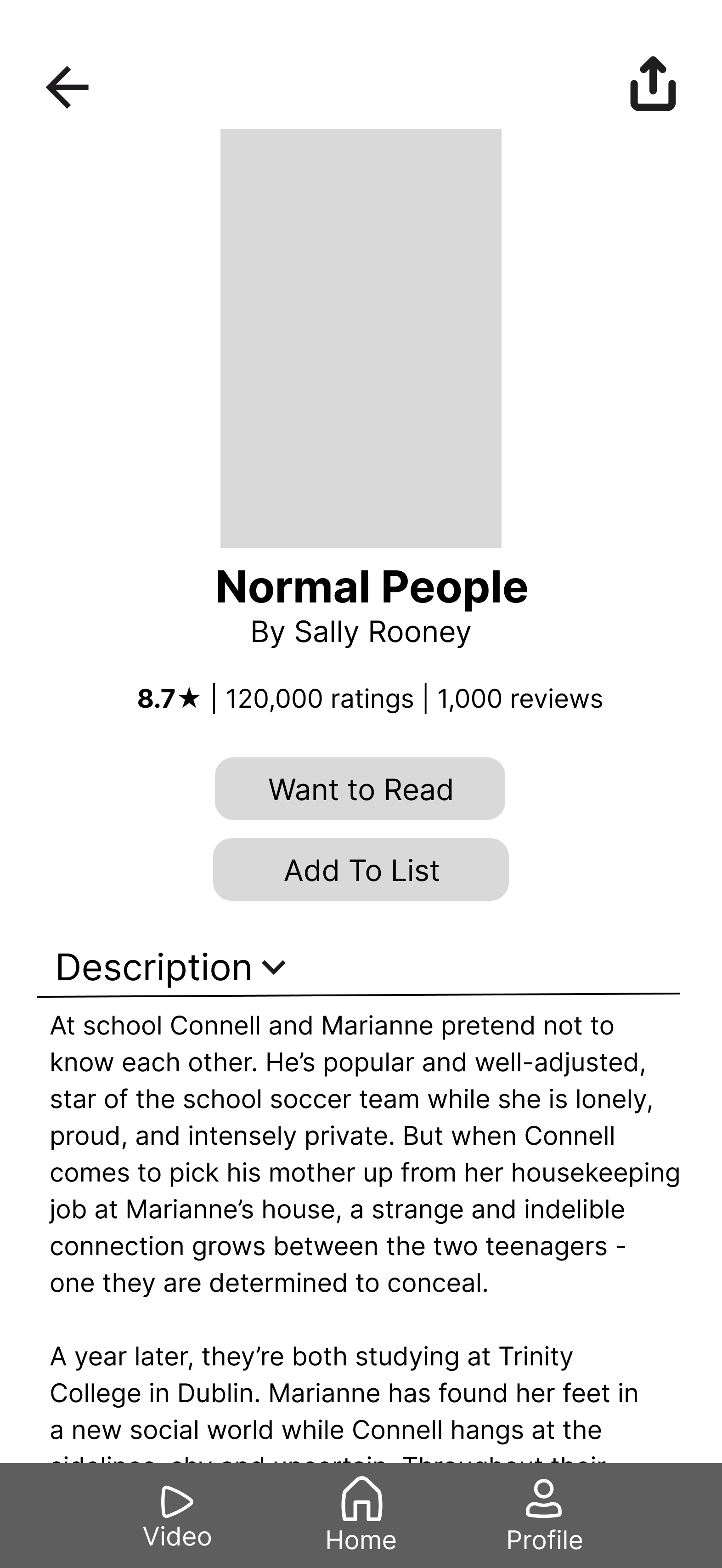
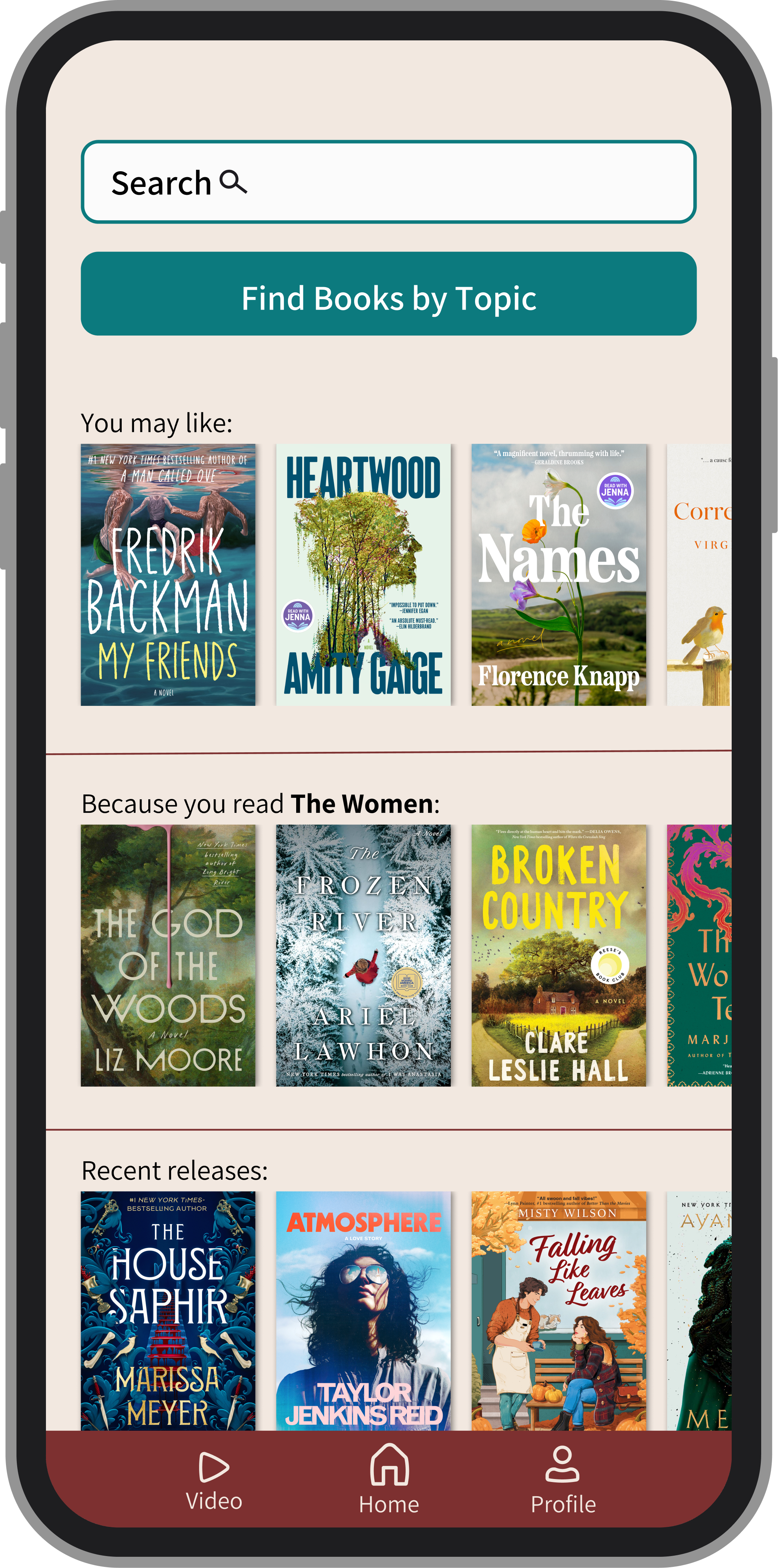
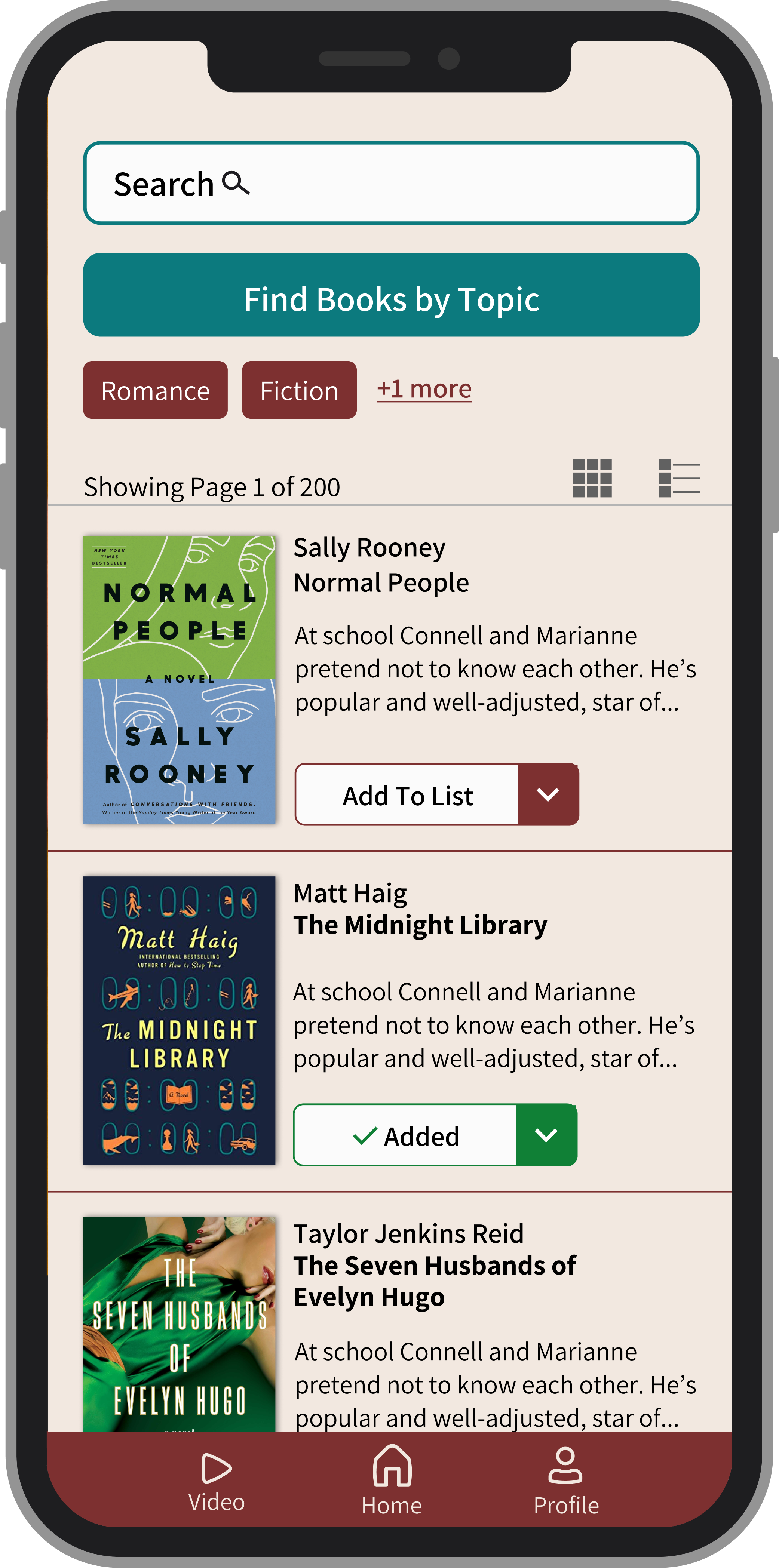
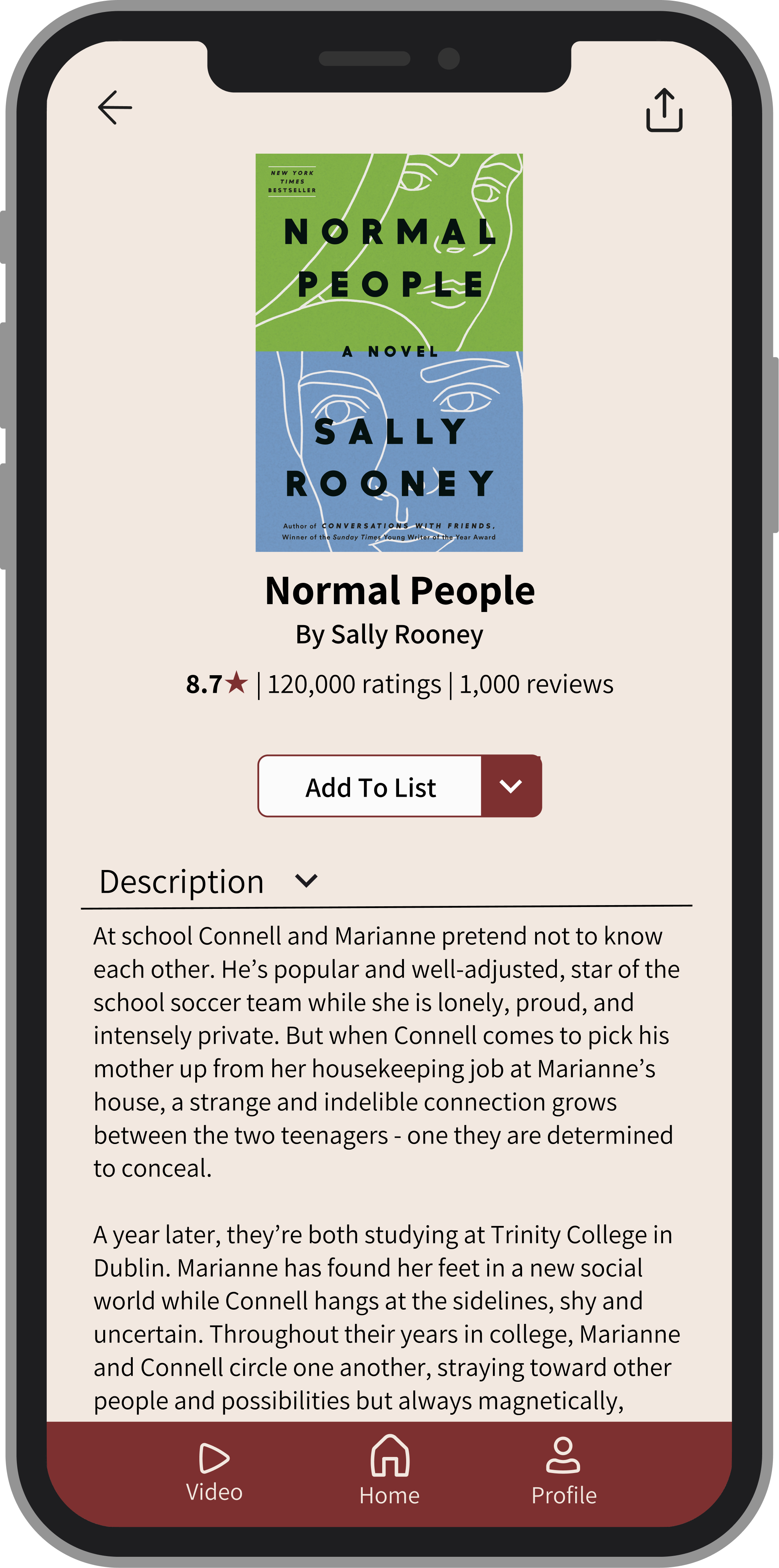
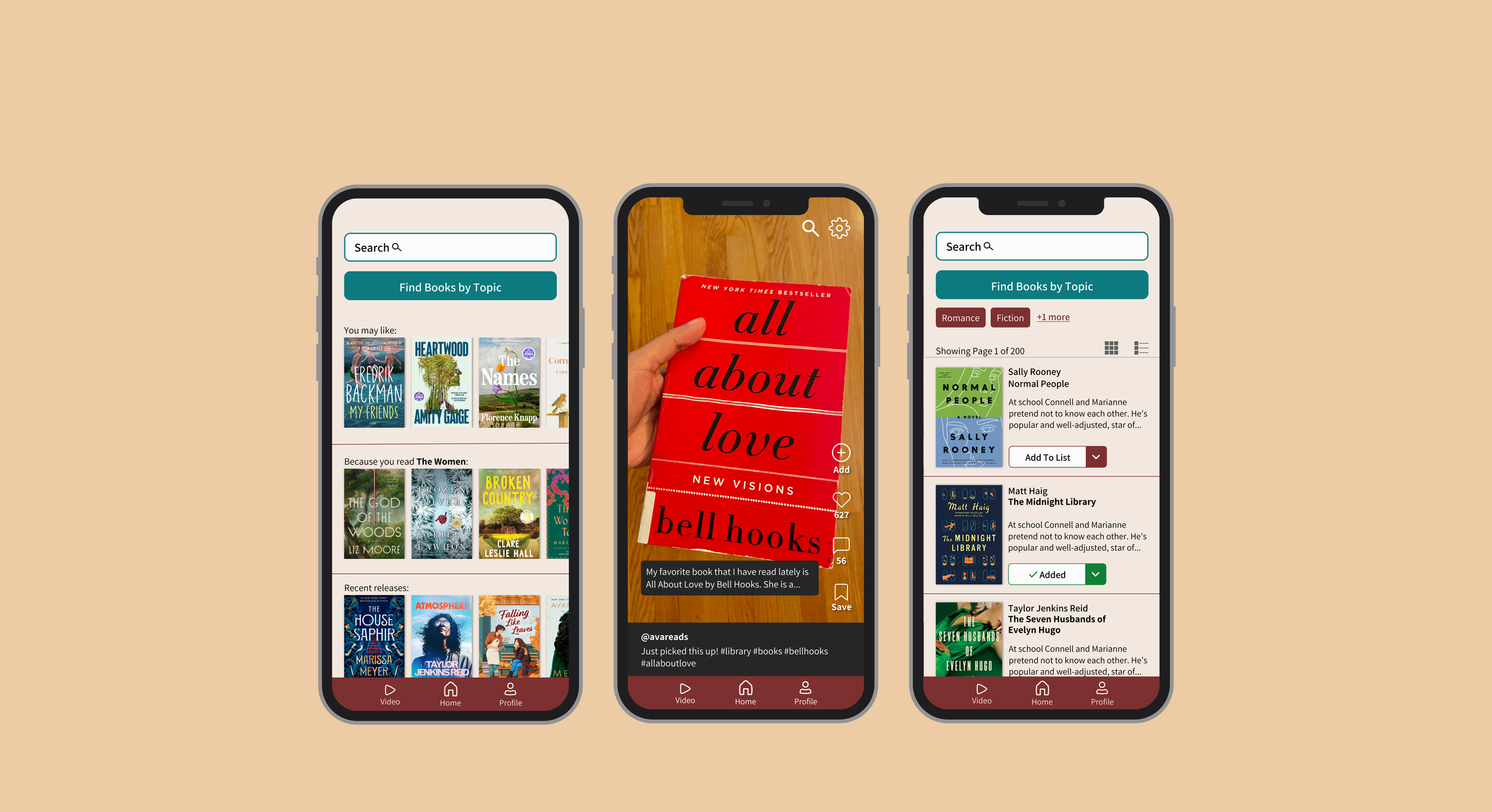
In Figma, I created low-fidelity wireframes. I designed a home page, where users can Explore by Category to find books based on filters. Then book recommendations populate, so users can find books and add them to their list. Additionally, users can use the video tab to for short videos and add books from the video to their list.
Design Pivot
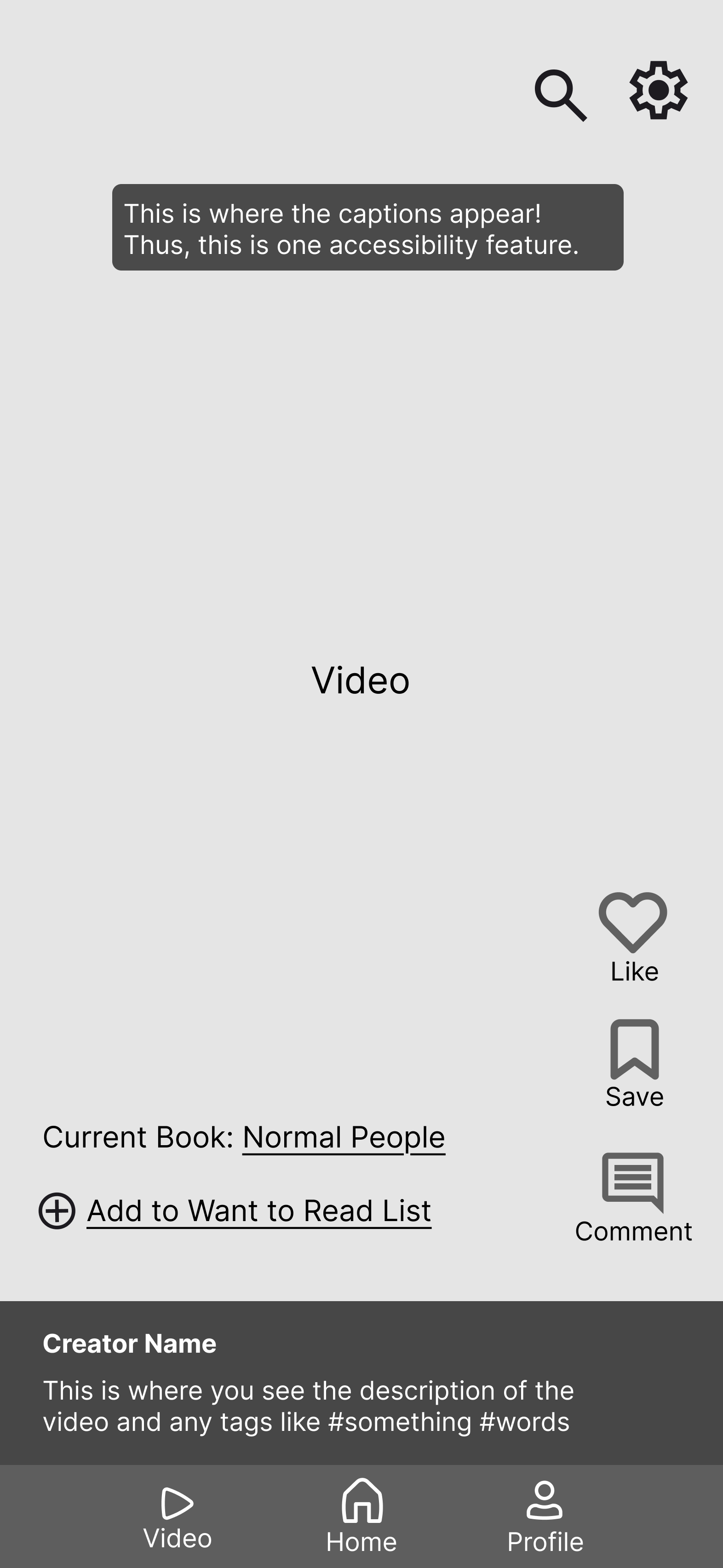
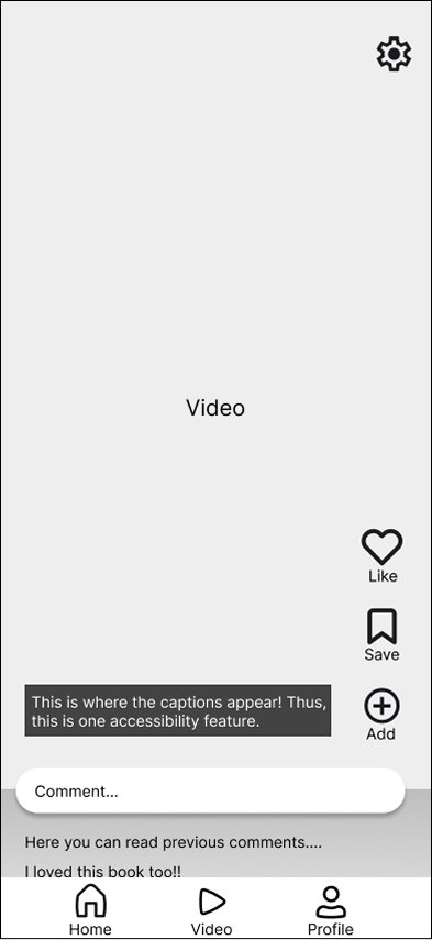
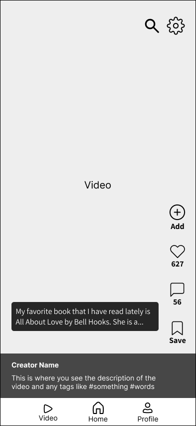
Changed bottom comments to instead include creator information and information
Comments became a part of the side buttons
Increased spacing in between buttons for accessibility
Added the search tab to look for videos
Increased the contrast and size of the captions
Moved add button to top of list, since it is the most important feature
With feedback from user testing, I made many iterations. This is one example from the short videos tab:
Before
After
Mockups
Through this app, I engaged in the product development lifecycle from interviews to prototype. It was extremely valuable to get interviews and have users test my product throughout its stages, in order to make sure the app truly met user needs. Overall, I loved creating this app as a book lover who struggles to find new books to read. Some next steps would be creating a profile page, and reading goals since interviews show that users want to set small goals daily.
