The Museum of Asian Art - App Design
Software
Figma, Procreate, Photoshop
Team
Solo
Timeline
3 Weeks
Background
I created an app for a fictional museum (The Museum of Asian Art) because I enjoy going to museums.
Challenge - People struggle to find upcoming exhibits online, and then buy tickets.
Goal - Create a page so people can search for current, upcoming, and past exhibits. Design a process so people can buy general tickets and special exhibits.
Sketches
First, I sketched low-fidelity wireframes in Procreate.
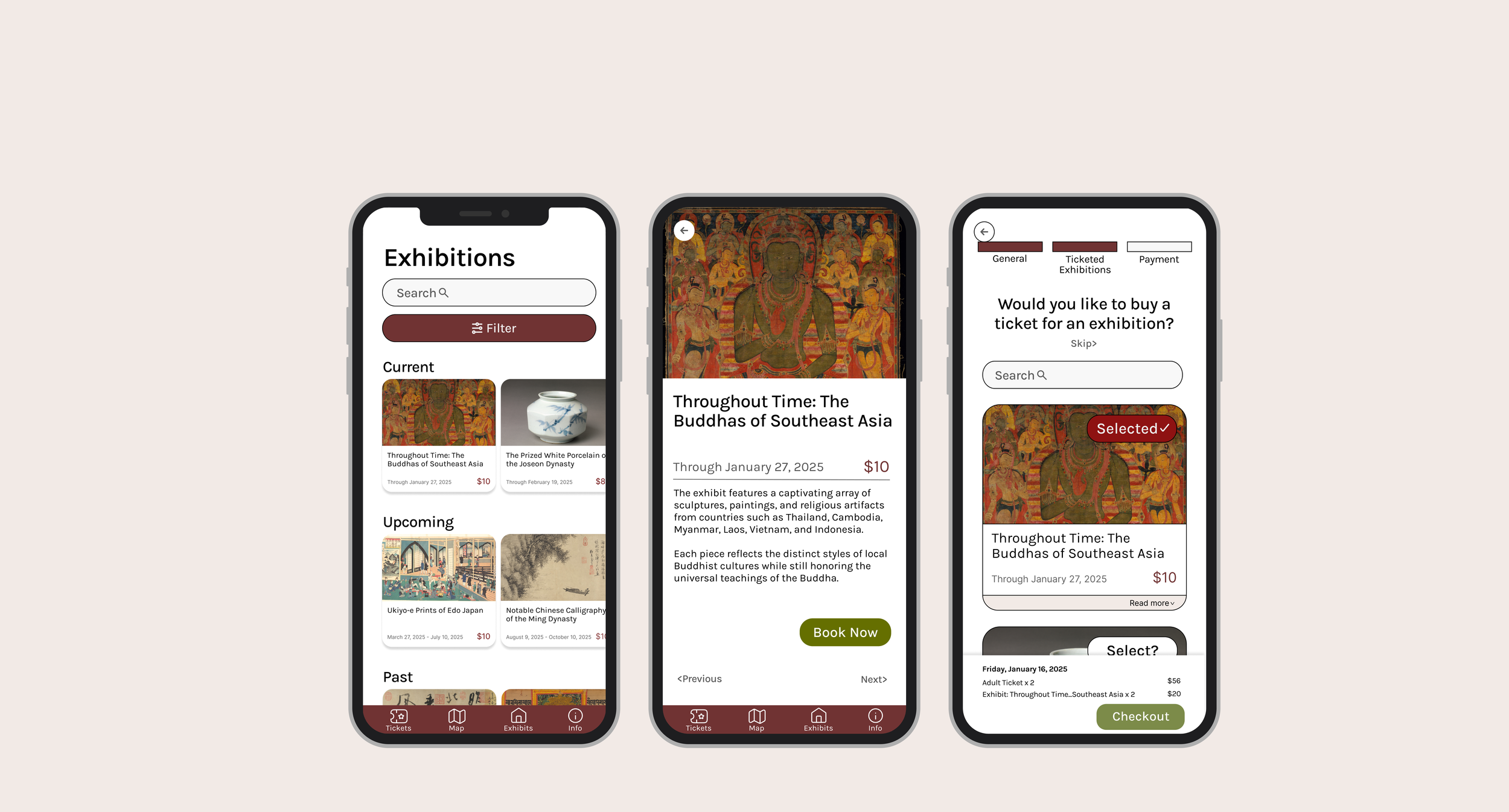
My first priority was designing cards with information for each exhibition.
First, I wrote down the information that should be in a card (picture, name, dates, cost).
Then, I made skeches. I considered cases like if exhibits had long names.
Secondly, I grouped the cards I made by status like current and upcoming exhibits. This way users can navigate the many exhibits on one exhibit overview page.
Also, they could use the search bar for specific exhibits / Sort and filter by info like dates.
My third priority was a specific exhibit page.
Users see descriptions, a book now button for quick checkout, and “previous/next” buttons to navigate to other exhibits.
Low-Fidelity Wireframes
Next, I designed the sketches in Figma. I considered various cases such as:
On the calendar screen, if users select Book Now of a specific exhibit, they can see the days it is available on the calendar because the dates are underlined. This would make it easier for them to know which days they can book for that exhibit.
If users want to select multiple exhibits, they can scroll through options and select them. If selected, it says “Selected,” with a checkmark.
Mockups
Finally, I created the high-fidelity mockups. I made sure there was consistent spacing and appropriate buttons sizes. All screens meet WCAG AA color contrast requirements. Looking back, there are some improvements I could have made.
On the first screen, I could have included an arrow next to “Current” and “Upcoming” exhibitions, so users can go to another page where they see many exhibits in a top-down layout, rather than a lot of scrolling.
On the fourth screen, I could have designed a smaller card that results in less scrolling when buying tickets for exhibitions.
The color palette could have been stronger and implemented more consistently across screens.
Through this app, I practiced many new UX concepts I read about, liked grouping and hierarchy. Furthermore, I implemented accessibility measures that I learned about like making big enough buttons and high color contrast. Overall, this project really strengthened my confidence in Figma. My biggest takeaways were honing on those foundational UX concepts, as well as the importance of sketching out many ideas to find the best solution.